Viewing Your Time Matters Calendar
/Time Matters provides a variety of ways to view your calendar. Here are some tips on how set it up.
Viewing Your Time Matters Calendar
A well-displayed calendar can save time and help you stay organized. Time Matters provides a variety of ways to view your calendar. Here are some tips on how set it up.
Calendar Options - General
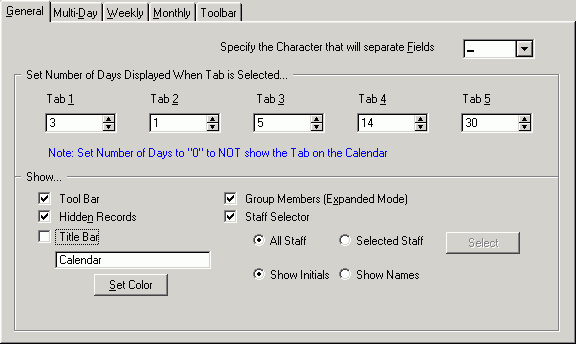
Go to your calendar by clicking on the Daily icon in the upper left corner of your Time Matters screen. To change your viewing options, right-click in the middle of the screen, then click Display Options. Click on the General Tab.

Calendar Options - General
We have made some improvements by changing some of the settings. We recommend the following:
-- Change the numbers for Tabs 1 through 5 to: 3,1,7,14,28
With these settings, the 3-day view is your default. It lets you see most of the details for today, but also anticipate tomorrow and the next day. By clicking on higher numbers when viewing the Calendar, you can see more and more days at the cost of less and less detail per entry.
-- Uncheck the Title Bar check box to save space on the screen
Calendar Options – Multi-Day
Now click on the Multi-Day tab. Here you can make some significant improvements.

Calendar Options - Multi-Day
On the Multi-Day tab, we recommend:
-- For the Description field, choose If Selected. This will make your calendar less cluttered and still allow you to quickly read a Description by clicking on an Event.
-- The Duration bar setting is up to you. We like Solid, but only after assigning Event code colors that show up well on the screen. (To assign colors, go to the Time Matters menu bar and click on File, Features Setup, Classification Codes, Event.)
-- In the Header Color field we pick Code. Occasionally we will temporarily switch this to Staff (but only if Staff colors have been assigned) when grappling with coordinating calendars for several people.
-- Uncheck Show Supporting Records. Now you will see more than just the current month on the right side of the screen.
-- Uncheck Show Record Tag Checkboxes because they are not used much and clutter up the screen.
-- Finally, we recommend changing the background color of the Calendar. A light yellow makes it more readable. Click on the Weekdays button, then on one of the yellow squares. That yellow is too bright, so now click on the Define Custom Colors button.

Set Background Color
On the right side of the screen is a vertical bar that ranges from white through yellow to black. Click on a light yellow spot, then click OK, OK to return to the Calendar.
Your Calendar should now do a better job of showing you when you are booked and when you are available. The three-day view can help you in your efforts to stay one step ahead of your clients.
Use a Larger Monitor
One last but very important tip: Buy larger monitors! A small investment in a larger monitor will help you use Time Matters far more than most other changes you might make. You would not settle for a desk with only enough room for one piece of paper. Why settle for a screen that cannot display a whole page or seven days of your calendar?

Time Matters Calendar on Large Monitor
You need a monitor that displays print big enough for you to read easily when the monitor is set to a resolution of 1024 by 768. Most monitors currently in use have 15 or 17-inch screens set to 800 by 600. That is too small to make really good use of modern software like Time Matters.
The best choice is an LCD monitor with a 17-inch or larger screen. Make sure that you can set the monitor to a resolution of 1024 by 768 and that it is readable at that setting. You can see much more of Time Matters lists and calendars as well as WordPerfect or Word documents when you use a larger screen.
We have a had good luck with refurbished units, but the lower price carries a much shorter warranty.


